
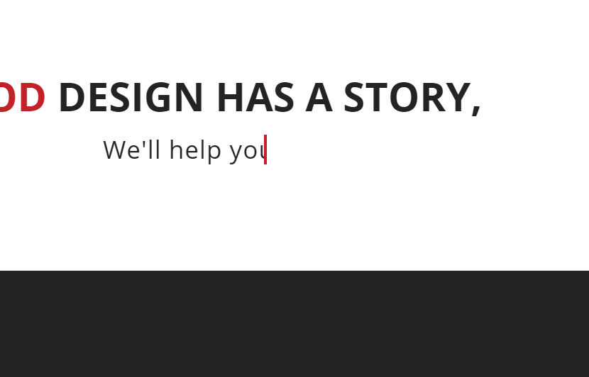
Quick tutorial on how to create the great typewriter/typing text effect (similar to that on the Torchlight Media homepage) on your headings using pure CSS.
Here’s the CSS code. The comments explain what each bit does… adjust the effect as needed for your design.
h1.typewriter {
overflow: hidden; /* Hides the content until revealed by the animation */
border-right: .2em solid #c02026; /* The typewriter cursor. Change colour as required */
white-space: nowrap; /* Keeps the content on a single line */
margin: 0 auto; /* Gives that scrolling effect as the typing happens */
letter-spacing: .2em; /* Adjust letter spacing to fit into your font */
animation: typing 3.5s steps(40, end), blink-caret .75s step-end infinite; /* Animate the heading. Play around with the settings as needed */}
/* The typing effect */
@keyframes typing {from { width: 0 }
to { width: 100% }}
/* The typewriter cursor effect */
@keyframes blink-caret {from, to { border-color: transparent }
50% { border-color: #c02026 }}
To enable the effect you just need to add the .typewriter class to your heading
<h1 class=”typewriter”>It’s that simple.</h1>